
| |Home | Project
Home | Lists | Forums| |  Francais Francais  Dansk Dansk |


Slicker
A collection of utilities which provide alternative for our beloved kicker.
Slicker consists of three primary items Cards, the Slider, and a Task-bar. Which can be used in conjunction with each other, and Kicker, or utilized by themselves.
Cards
![]() Cards
provide a frame work for embedded applets to be docked at the edge of
the screen. These cards are "stackable" and provide a
"retractable/extendable"
work area.
Cards
provide a frame work for embedded applets to be docked at the edge of
the screen. These cards are "stackable" and provide a
"retractable/extendable"
work area.
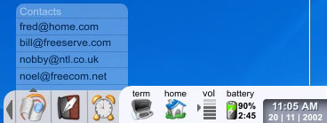
There are several basic areas of the Cards the TitleApp, notification icon, morearrow, appspace, launchbutton, popup.
The TitleApp area by default reflects the name of the Kard, other applets can be written for this area, such as quicklaunch, Mixer, Instant Messenger controls.
The Notification Icon provides the Kard Applets a way of communicating with the user when the Kard is retracted. If more than one Applet needs to notify the user, then the icon will flash, and, if it is necessary, cycle through requesting applets Notification icons.
The Popup area provides a mechanism for applets to notify the user of events in a more intrusive and noticable way, that provides more information to the user. The user will be able to control how long this popup should be visible, or whether it should wait for user interaction (all on a per applet basis) ... the applet has the ability to over ride these settings in cases of critical notifications, but should allow the control of this to be managed by the user, along with any special effects used to display it.
The Appspace is an area in the Kard that the selected applets display in. Applets should have 'brake' points that will allow the Cards to split them out horizontal in the event the Kard is placed on the right or left sides of the screen. Applet examples would be the default kmenu, kprocess, sysinfo, PIM, IM, and media-player applets. Also a Custom menu applet would be built into the Cards to allow the user to create a custom menu.
The MoreArrow is an indicator that the card is either retracted or extended, and provides a "non-active" area to click on to extended/retract the card.
The Launch button, a button located at the base of the card, and remains their even when the card is extended, this also provides a place to allows a dedicated card to be created by the applet developer, which allows for special functions even while the card is retracted. (example kmenu, or possibly an IM applet)
The Slider
 The
slider is a corner piece to Slicker, it provides a constant,
"solid"
launching pad. The slider is comprised on two primary areas the shade
and sheath, and is home of the miniapps.
The Sheath contains an area for miniapps, (volume, batter power, applaunchers) and is the docking base for the shade.
The shade provides a retractable toolbar of miniapps (which can be turned on/off)
Miniapps are small applets that usually are icon size, but can be wider (example: clock miniapp) These apps have have specialized menus that contain quickmenus (other Miniapp examples: PIM with quickmenu to basic areas of the PIM, or task performed by PIM, specific areas of the PIM Miniapps such as email, with quickcontact list, or folder list, calendar with todo list, etc etc)
The Miniapps also have the ability to create a Popup, like the Cards, to alert users to information.
The Taskbar
![]() A typical taskbar with not so typical features... The taskbar is an
"organic" app that cleanly expands or contracts as needed (with consideration to settings the User configures) Transparent, it organizes windows according to it's configuration. Can also be called as a Kard applet, or as a miniap.
A typical taskbar with not so typical features... The taskbar is an
"organic" app that cleanly expands or contracts as needed (with consideration to settings the User configures) Transparent, it organizes windows according to it's configuration. Can also be called as a Kard applet, or as a miniap.